library(ggplot2)
library(scales)
time_series_ggstyle <- list(
  scale_y_continuous(labels = label_number(scale_cut = cut_si(' ')), expand = c(0, 0.1)),
  theme_bw(base_size = 20),
  theme(
    axis.title.x = element_blank(),
    panel.border = element_blank(),
    axis.line = element_line(color = "black"),
    legend.position = 'top'
  )
)Modeling
Getting into modelling!
Required skills
- Data-science teams have different skill requirements:
Types of analyses
- Four types of data stories:
- Descriptive - What has happened?
- Predictive - What will happen?
- Causal - Why does it happen?
- Prescriptive - What actions should be taken?
Setup: ggplot2
- Import required packages
- Define a list of layers for consistent styling throughout the project
Descriptive
Attaching package: 'readr'The following object is masked from 'package:scales':
col_factor── Attaching core tidyverse packages ──────────────────────── tidyverse 2.0.0 ──
✔ dplyr 1.1.4 ✔ purrr 1.0.2
✔ forcats 1.0.0 ✔ tibble 3.2.1
✔ lubridate 1.9.3 ✔ tidyr 1.3.1── Conflicts ────────────────────────────────────────── tidyverse_conflicts() ──
✖ readr::col_factor() masks scales::col_factor()
✖ purrr::discard() masks scales::discard()
✖ dplyr::filter() masks stats::filter()
✖ dplyr::lag() masks stats::lag()
ℹ Use the conflicted package (<http://conflicted.r-lib.org/>) to force all conflicts to become errors
Attaching package: 'data.table'

The following objects are masked from 'package:lubridate':

    hour, isoweek, mday, minute, month, quarter, second, wday, week,
    yday, year

The following objects are masked from 'package:dplyr':

    between, first, last

The following object is masked from 'package:purrr':

transposeoptions(scipen = 99999)
charts <- fread("data/charts_at_global.csv.gz")
ts <- str_detect(tolower(charts$artistName), "taylor swift")
charts_ts <- charts[ts, ]
filter(charts_ts, format(day, "%Y") == "2019" & region == "global") |>
group_by(day) |>
mutate(streams = sum(streams)) |>
ggplot(aes(x = day, y = streams)) +
geom_line() +
scale_x_date(
breaks = seq(as.Date("2019-01-01"), as.Date("2019-12-31"), "month"),
date_labels = "%b"
) +
geom_vline(xintercept = as.Date("2019-08-23"), color = "red") +
annotate("text", x = as.Date("2019-08-20"), label = "Release of 'Lover'", y = 40000000, colour = "red", angle = 90, size = 8) +
ggtitle("Taylor Swift Streams", subtitle = "Songs in top 200 - 2019") +
time_series_ggstyle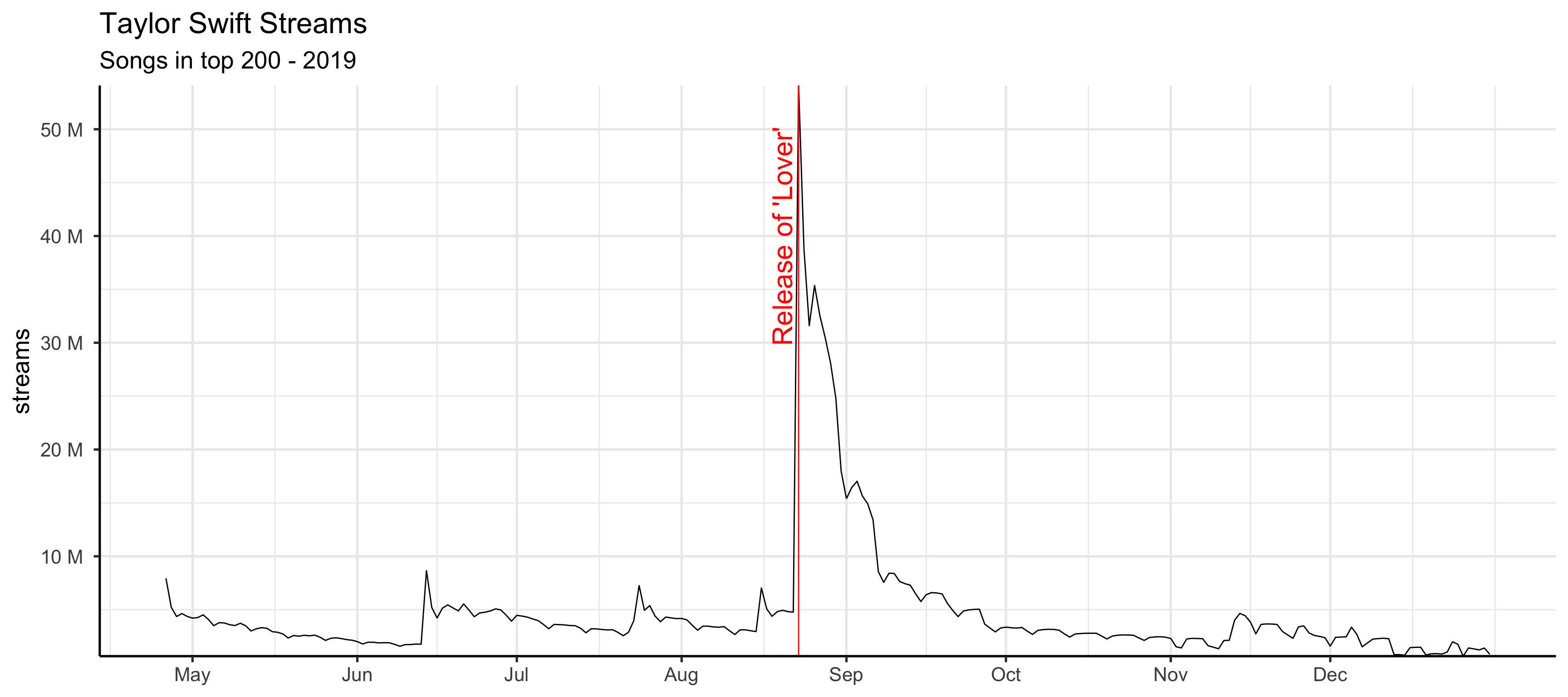
Predictive
library(zoo)
Attaching package: 'zoo'The following objects are masked from 'package:data.table':
yearmon, yearqtrThe following objects are masked from 'package:base':
as.Date, as.Date.numericlibrary(prophet)Loading required package: RcppLoading required package: rlang
Attaching package: 'rlang'The following object is masked from 'package:data.table':
:=The following objects are masked from 'package:purrr':
%@%, flatten, flatten_chr, flatten_dbl, flatten_int, flatten_lgl,
flatten_raw, invoke, splicetotal_streams <- charts |>
filter(region == "global") |>
group_by(day) |>
summarize(y = sum(streams)) |>
mutate(ds = as.Date(day)) |>
select(-day)
total_streams_model <- filter(total_streams, ds <= as.Date("2020-12-31"), ds >= as.Date("2019-01-01"))
total_streams_holdout <- filter(total_streams, ds >= as.Date("2021-01-01"))
mod <- prophet(total_streams_model,
holidays = data.frame(
holiday = "christmas",
ds = c(
as.Date("2019-12-25"),
as.Date("2020-12-25"),
as.Date("2021-12-25")),
lower_window = -1, upper_window = 0
),
daily.seasonality = FALSE
)
future <- make_future_dataframe(mod, periods = 365)
forecast <- predict(mod, future)
plot(mod, forecast) +
labs(
y = "Streams",
title = "Prediction of total global streams of top 200",
subtitle = "Observed: 2019-2020, forecast: 2021 (holdout: red)"
) +
time_series_ggstyle +
geom_point(data = total_streams_holdout,
aes(x = as.POSIXct(ds), y = y), color = 'red')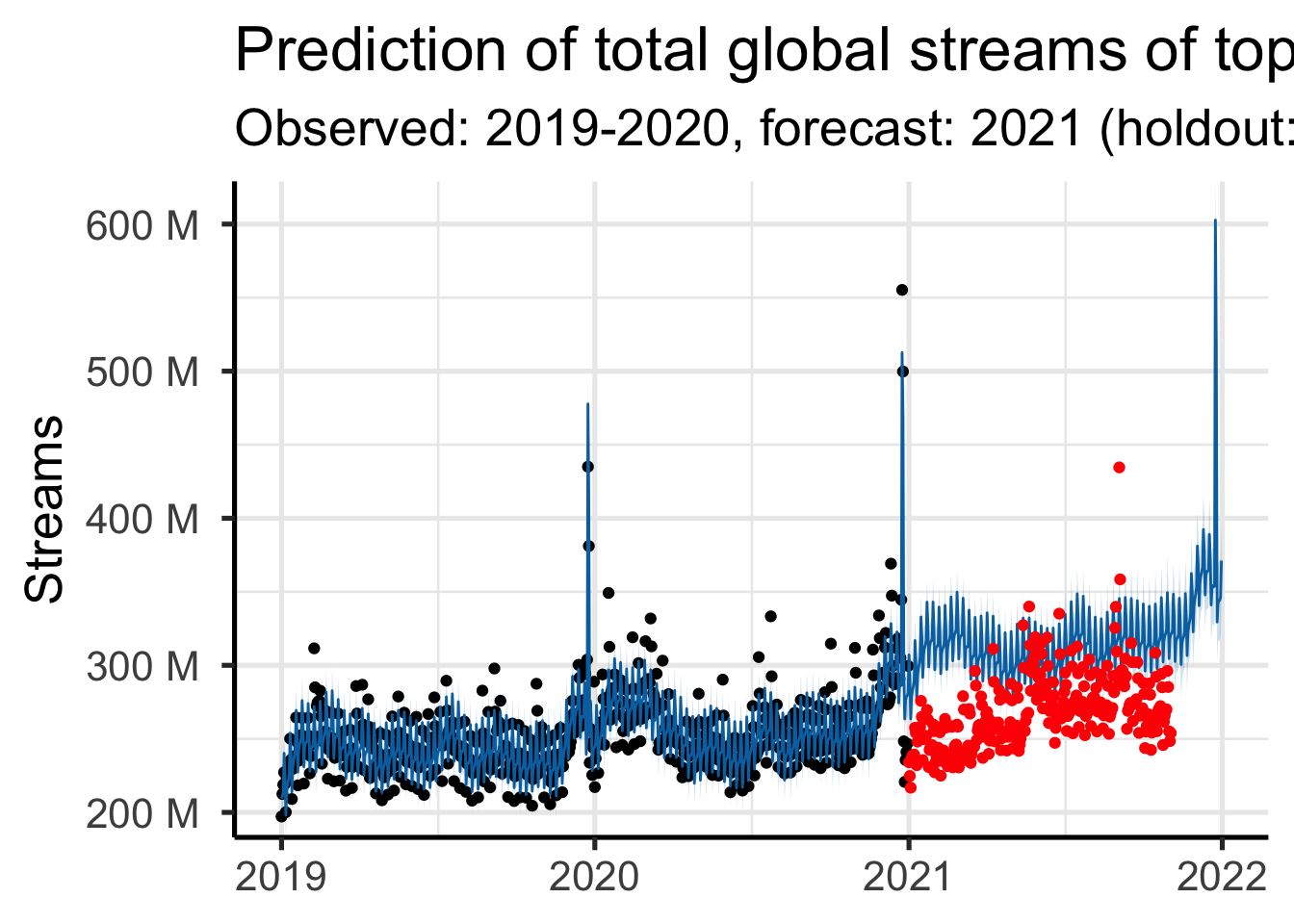
What about Causality?
Causal inference and Prediction
- Variables can be predictive without a causal relationship
- Correlation does not imply causation
- Arcade revenue predicts CS doctorates (and vice versa)
. . .
- Variables can be bad predictors but have a causal relationship
- No correlation does not imply no causation
- Fuel used and speed on cruise control (uphill vs. flat)


- Variables can be predictive while not being predictive
Andrew Gelman
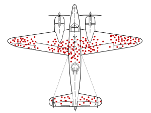
Selection bias
- For which “population” is the sample representative?
Causal but no correlation
set.seed(123)
xy <- data.frame(x = rnorm(100000))
xy$y <- 0.5 * xy$x^2 + 2 * xy$x^4
ggplot(xy, aes(x = x, y = y)) +
geom_line() +
geom_smooth(method = "lm", color = "blue") +
labs(title = expression(y == 0.5 * x^2 + 2 * x^4), subtitle = "Non-linear relation") +
annotate("text",
x = -1, y = 25,
label = paste0(
"Best linear fit. Correlation: ",
round(cor(xy$x, xy$y), 3)
), hjust = 0, color = "blue", size =8
) +
time_series_ggstyle
`geom_smooth()` using formula = 'y ~ x'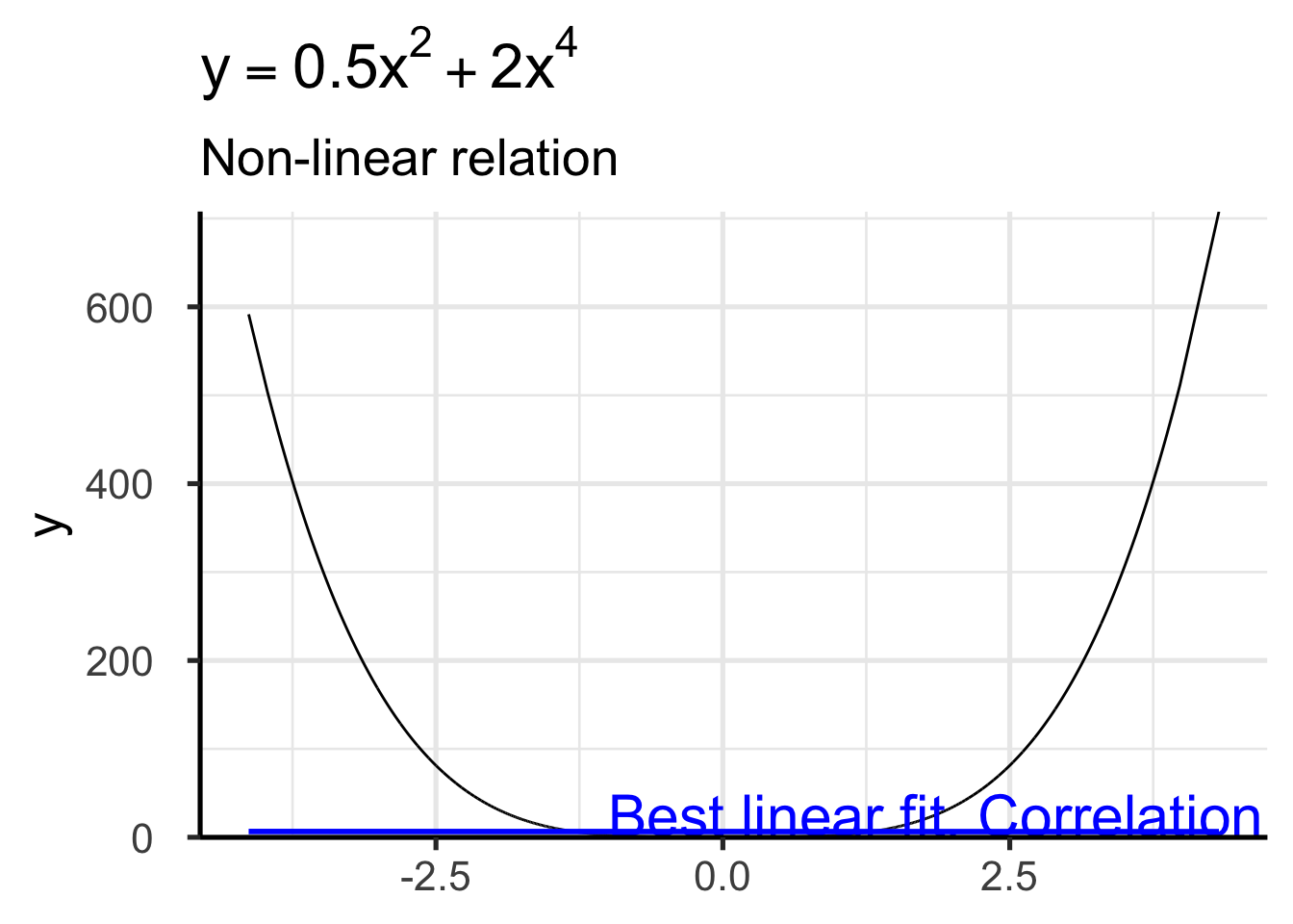
Correlation without Correlation
set.seed(42)
xy <- data.frame(x = rnorm(1000), y = rnorm(1000))
xy$obs <- abs(xy$x + xy$y) < 0.5 + runif(1000,0,2)
ggplot(xy, aes(x=x, y=y)) +
    geom_point(aes(color=obs)) +
    geom_smooth(data = xy[xy$obs,],
    method = 'lm', se = FALSE, color = "#00BFC4") +
    geom_smooth(method = 'lm', se = FALSE) +
    time_series_ggstyle +
    labs(color = "Observed",
        title = "Restaurant and location quality",
        subtitle="Survivor bias",
        y = "Restaurant Quality", x = "Location Quality") +
    annotate('text',
            x = 2, y = -0.2, hjust=0,
            label = "Population regression line",
            color = "blue", size = 8 ) +
    theme(axis.title.x = element_text())
`geom_smooth()` using formula = 'y ~ x'
`geom_smooth()` using formula = 'y ~ x'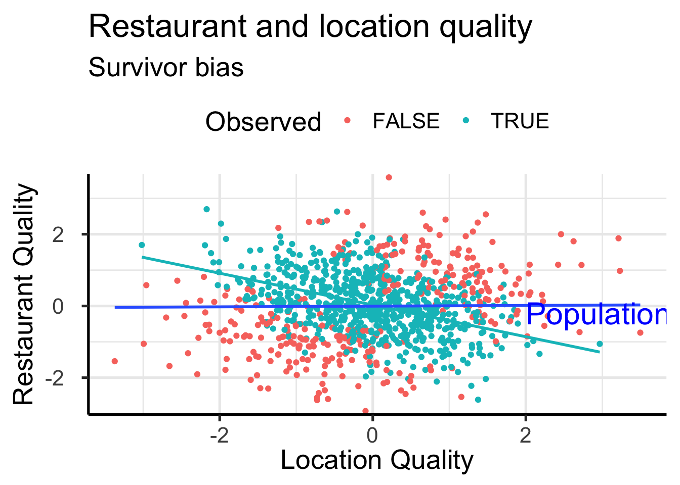
Correlation but different but still Correlation
Equivalent datasets based on estimate
library(datasauRus)
library(kableExtra)
Attaching package: 'kableExtra'The following object is masked from 'package:dplyr':
group_rowssuppressPackageStartupMessages(library(dplyr))
data <- datasaurus_dozen %>%
filter(dataset %in% c(
"away",
"bullseye",
"circle",
"dino",
"high_lines",
"wide_lines",
"x_shape",
"star"
))
data %>%
group_by(dataset) %>%
summarize(
mean_x = round(mean(x), 2),
mean_y = round(mean(y), 2),
std_dev_x = round(sd(x), 2),
std_dev_y = round(sd(y), 2),
corr_x_y = round(cor(x, y), 2)
) %>%
mutate(dataset = stringr::str_replace(dataset, "_", " ")) %>%
kbl(
col.names =
c("data", "mean x", "mean y", "sd x", "sd y", "corr x,y"),
format = "html", table.attr = "style='width:100%;'"
) %>%
column_spec(1, width = "3cm")| data | mean x | mean y | sd x | sd y | corr x,y |
|---|---|---|---|---|---|
| away | 54.27 | 47.83 | 16.77 | 26.94 | -0.06 |
| bullseye | 54.27 | 47.83 | 16.77 | 26.94 | -0.07 |
| circle | 54.27 | 47.84 | 16.76 | 26.93 | -0.07 |
| dino | 54.26 | 47.83 | 16.77 | 26.94 | -0.06 |
| high lines | 54.27 | 47.84 | 16.77 | 26.94 | -0.07 |
| star | 54.27 | 47.84 | 16.77 | 26.93 | -0.06 |
| wide lines | 54.27 | 47.83 | 16.77 | 26.94 | -0.07 |
| x shape | 54.26 | 47.84 | 16.77 | 26.93 | -0.07 |
Always visualize
library(ggplot2)
library(colorspace)
ggplot(data, aes(x = x, y = y, colour = dataset)) +
geom_point(size = 4.5) +
theme_void() +
theme(
legend.position = "none",
strip.text.x = element_text(size = 30)
) +
facet_wrap(~dataset, nrow = 4) +
scale_color_discrete_qualitative(palette = "Dynamic")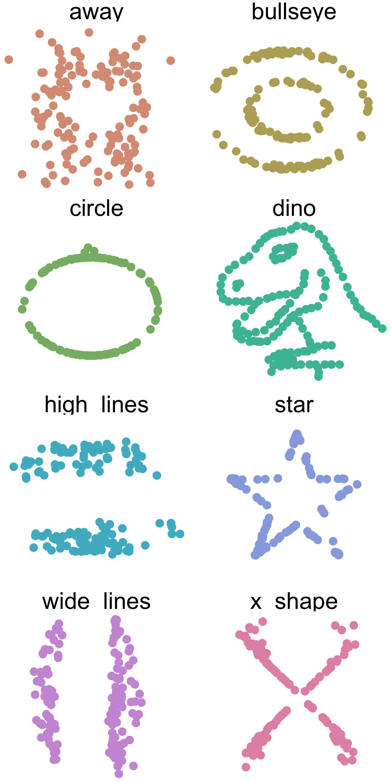
Quality of music and income
- Data: Ratings by music experts, genre, streams
- Question: Causal effect of rating on income
library(modelsummary)
library(gt)
set.seed(1)
N <- 5000
genre <- rbinom(N, 1, 0.5)
perfect_rating <- as.factor(rbinom(N, 5, 0.8 - 0.7 * genre)>4)
streams <- rexp(N, 0.01 - 0.003 * genre) |> floor()
modelsummary(
    list(lm(streams~perfect_rating),
    lm(streams~genre),
    lm(streams~perfect_rating + genre)),
    coef_rename = c("perfect_ratingTRUE" = "perfect rating"),
    stars = TRUE,
    statistic = "{p.value}",
gof_map = NA)| (1) | (2) | (3) | |
|---|---|---|---|
| (Intercept) | 122.711*** | 97.408*** | 97.314*** |
| <0.001 | <0.001 | <0.001 | |
| perfect rating | −25.112*** | 0.285 | |
| <0.001 | 0.956 | ||
| genre | 43.268*** | 43.361*** | |
| <0.001 | <0.001 | ||
| + p < 0.1, * p < 0.05, ** p < 0.01, *** p < 0.001 |
Grades and happyness
- Data: grades, self_esteem index, happyness index
- Question: Causal effect of grades on happyness
set.seed(42)
range_normalize <- function(x, min_range = 0, max_range = 100){
  x_norm <- min_range + (x - min(x)) * (max_range - min_range) / (max(x) - min(x))
}
grades <- 1 + rbinom(N, 4, 0.04)
self_esteem <- range_normalize(100 * (1/grades + rnorm(N)))
happyness <- range_normalize(5 + self_esteem + rnorm(N))
modelsummary(
    list(lm(happyness~grades),
    lm(happyness~self_esteem),
    lm(happyness~grades+self_esteem)),
    coef_rename = c("self_esteem" = "self esteem"),
    stars = TRUE,
    statistic = "{p.value}",
gof_map = NA)| (1) | (2) | (3) | |
|---|---|---|---|
| (Intercept) | 61.393*** | 1.510*** | 1.551*** |
| <0.001 | <0.001 | <0.001 | |
| grades | −5.958*** | −0.029 | |
| <0.001 | 0.430 | ||
| self esteem | 0.989*** | 0.988*** | |
| <0.001 | <0.001 | ||
| + p < 0.1, * p < 0.05, ** p < 0.01, *** p < 0.001 |
Restaurant and location ratings
- Data: Restaurant ratings, location ratings, restaurant survival prob.
- Question: Causal effect of location rating on restaurant rating
set.seed(14)
restaurant_rating <- 25 + 10*rnorm(N)
location_rating <- 5*rnorm(N)
survival_probability <- range_normalize(0.8*restaurant_rating + 0.8 * location_rating + 10*rnorm(N), 0, 100)
modelsummary(
    list(lm(restaurant_rating~location_rating),
    lm(restaurant_rating~survival_probability),
    lm(restaurant_rating~survival_probability + location_rating)),
    coef_rename = c(
                    "location_rating" = "location rating",
                    "survival_probability" = "survival prob."
                    ),
    stars = TRUE,
    output = 'gt',
    statistic = "{p.value}",
    gof_map = NA) |>
    tab_style(style = cell_fill(color='lavenderblush3'),
              locations = cells_body(rows = 3)
)| (1) | (2) | (3) | |
|---|---|---|---|
| (Intercept) | 24.875*** | 3.151*** | 0.996* |
| <0.001 | <0.001 | 0.023 | |
| location rating | 0.022 | -0.390*** | |
| 0.440 | <0.001 | ||
| survival prob. | 0.414*** | 0.455*** | |
| <0.001 | <0.001 | ||
| + p < 0.1, * p < 0.05, ** p < 0.01, *** p < 0.001 | |||
Causal Inference: two approaches (Imbens 2020)
- Directed Acyclic Graphs (DAGs)
- Concerned with identification of causal relationships
- Shows direction of causality and important variables
- Graphical representation:
library(ggdag)
Attaching package: 'ggdag'The following object is masked from 'package:stats':
filterlibrary(dagitty)
library(tidyverse)
dagify(y ~ x, x ~ z, exposure = "x", outcome = "y",
coords = list(x = c(x = 1, y = 1.5, z = 1), y = c(x=1, y = 1, z=0))
) %>%
tidy_dagitty() %>%
ggdag(text_size = 8, node_size = 10) +
geom_dag_edges() +
annotate("text", x = 1.2, y = 1, vjust=1, label= "x causes y", size=5 ) +
annotate("text", x = 1, y = 0.5, hjust=-0.1, label="z causes x", size = 5) +
theme_dag()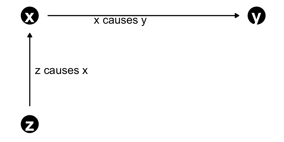
- Potential Outcome
- Multiple Treatments / Causes
e.g., exposure to ad - Potential outcomes f. treatments
e.g., Purchase given exposure / no exposure - Multiple observations with different treatments
e.g., A/B test - Focus on assignment of treatment
e.g., randomized experiment, selection on (un)observables
\[ \begin{aligned} y_i(0)& \ldots \text{outcome of individual }i\text{ without treatment} \\ y_i(1)& \ldots \text{outcome of individual }i\text{ with treatment} \\ \delta_i = y&_i(1) - y_i(0) \ldots \text{treatment effect of individual }i \end{aligned} \]
- Observed: \(y_i = D_i * y_i(1) + (1-D_i) * y_i(0)\) where \(D_i\) is the treatment indicator
Analyzing DAGs: d-separation
- Necessary to decide which variables to use in model
- “d” stands for “directional”
- Usually we are dealing with more than two variables
- Complication: causation flows only directed - association might flow against
dagify(z ~ x, y2 ~ z, a ~ x, a ~ y3, x ~ d, y1 ~ d,
       coords = list(x = c(x = 1, z = 1.5, y2 = 2, a = 1.5, y3 = 2, d = 1.5, y1 = 2),
                     y = c(x = 1, y2 = 1, z = 1, a = 0, y3 = 0, d = 2, y1 = 2))
) %>%
  tidy_dagitty() %>%
  ggdag(text_size = 3, node_size = 5) +
  geom_dag_edges() +
  theme_dag() +
  labs(title= "Causal Pitchfork", subtitle = "x and y2 are d-connected but x and y1/y3 are not") +
  theme(title = element_text(size = 8))
Analyzing DAGs: Fork
Good Control
med <- dagify( x ~ d, y1 ~ d,
       coords = list(x = c(x = 1, z = 1.5, y = 2, a = 1.5, b = 2, d = 1.5, y1 = 2),
                     y = c(x = 1, y = 1, z = 1, a = 0, b = 0, d = 2, y1 = 2))
) %>%
  tidy_dagitty() %>%
  mutate(fill = ifelse(name == "d", "Confounder", "variables of interest")) %>%
  ggplot(aes(x = x, y = y, xend = xend, yend = yend)) +
  geom_dag_point(size=7, aes(color = fill)) +
  geom_dag_edges(show.legend = FALSE)+
  geom_dag_text() +
  theme_dag() +
  theme(legend.title  = element_blank(),
        legend.position = "top")
med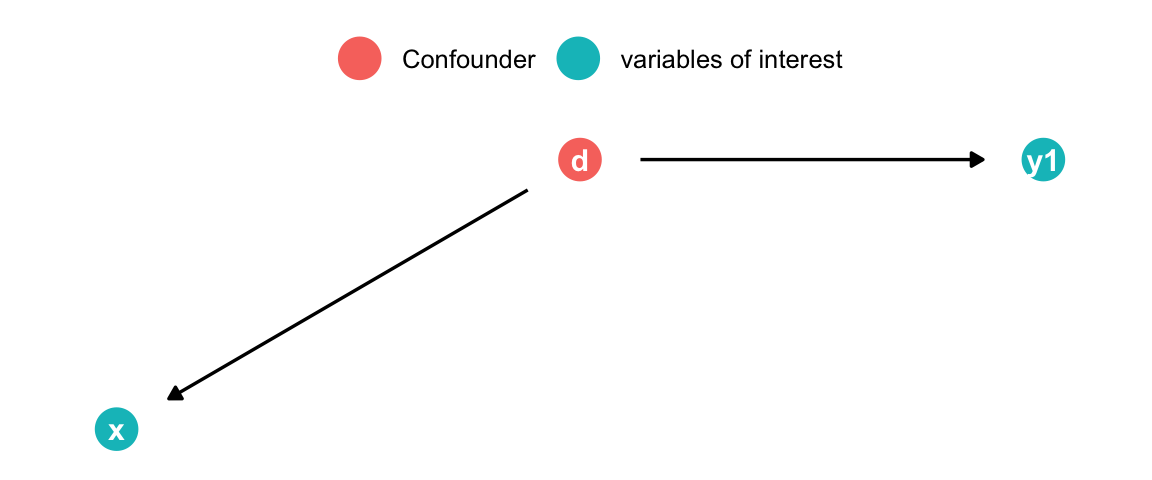
- d causes both x and y1
- Arrows pointing to x are called “back-door” paths
- Eliminated by randomized experiment! Why?
- Controlling for d “blocks” the non-causal association x \(\rightarrow\) y1
Analyzing DAGs: Pipe
Bad Control (possibly use mediation analysis)
med <- dagify(z ~ x, y2 ~ z,
       coords = list(x = c(x = 1, z = 1.5, y2 = 2), y = c(x=1, y2 = 1, z=1))
) %>%
  tidy_dagitty() %>%
  mutate(fill = ifelse(name == "z", "Mediator", "variables of interest")) %>%
  ggplot(aes(x = x, y = y, xend = xend, yend = yend)) +
  geom_dag_point(size=7, aes(color = fill)) +
  geom_dag_edges(show.legend = FALSE)+
  geom_dag_text() +
  theme_dag() +
  theme(legend.title  = element_blank(),
        legend.position = "top")
med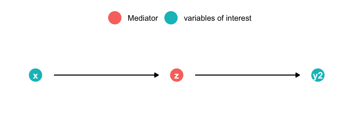
- x causes y through z
- Controlling for z blocks the causal association x \(\rightarrow\) y2
Analyzing DAGs: Collider
Bad control
dagify(a ~ x, a ~ y,
  coords = list(x = c(x = 1, y = 2, a = 1.5), y = c(x = 1, y = 0,  a = 0))
) |>
  tidy_dagitty() |>
  mutate(fill = ifelse(name == "a", "Collider", "variables of interest")) |>
  ggplot(aes(x = x, y = y, xend = xend, yend = yend)) +
  geom_dag_point(size = 7, aes(color = fill)) +
  geom_dag_edges(show.legend = FALSE) +
  geom_dag_text() +
  theme_dag() +
  theme(
    legend.title = element_blank(),
    legend.position = "top"
  )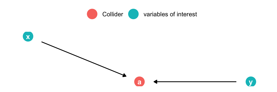
- x & y cause a
- x & y are d-separated and uncorrelated
- By adding a to the model spurious correlation between x & y is introduced
Exercise
Which variables should be included?
- Effect of x on y
- Effect of z on y
library(ggdag)
library(dagitty)
library(tidyverse)
dagify(y ~ n + z + b + c,
       x ~  z + a + c,
       n ~ x,
       z ~ a + b, exposure = "x", outcome = "y",
       coords = list(x = c(n = 2, x = 1, y = 3, a = 1, z = 2, c = 2, b = 3), y = c(x = 2, y = 2, a = 3, z = 3, c = 1, b = 3, n = 2))) %>%
  tidy_dagitty() %>%
  ggdag(text_size = 8, node_size = 12) +
  geom_dag_edges() +
  theme_dag()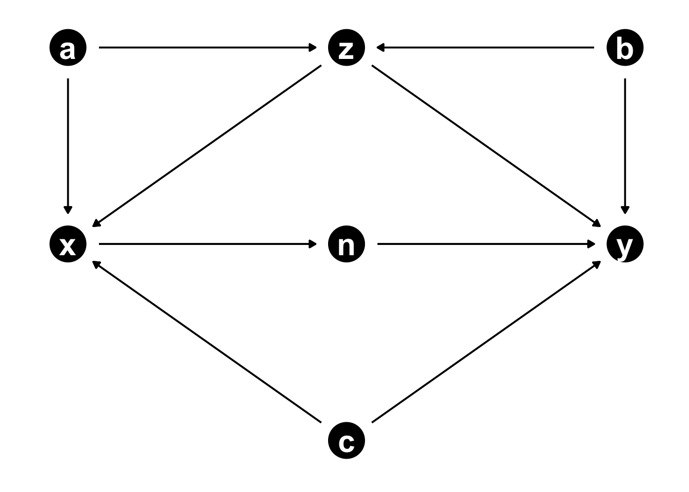
For x -> y:
Add the following to model:
- c (confounder)
- z (confounder) but opens collider
- a or b to block collider path (b statistically more efficient)
Mediator:
- n
For z -> y:
Add the following to model:
- b (confounder)
- a (confounder)
- c (not necessary but not harmful)
Mediators:
- x (also include c)
- n (also include c)
Common bad controls (Cinelli, Forney, and Pearl 2020)
library(ggpubr)
p1 <- dagify(y ~ x + U2,
       a ~ U1 + U2,
       x ~ U1,
      coords = list(x = c(x = 1, y = 2, a = 1.5, b = 1.5, U1 = 1, U2 = 2), y = c(x=1, y = 1,  a = 1.5, b = 0, U1 = 2, U2 = 2))
) %>%
  tidy_dagitty() %>%
  mutate(fill = ifelse(name %in% c("U1", "U2"), "Unobserved", "Observed")) %>%
  ggplot(aes(x = x, y = y, xend = xend, yend = yend)) +
  geom_dag_point(size=12,
                 aes(color = fill)
                 ) +
  geom_dag_edges(show.legend = FALSE)+
  geom_dag_text() +
  theme_dag() +
  theme(legend.title  = element_blank(),
        legend.position = "bottom") +
  labs(title = "M-Bias")
p2 <- dagify(y ~ a + U,
       a ~ x + U,
      coords = list(x = c(x = 1, y = 2, a = 1.5, b = 1.5, U = 1.7, U2 = 2), y = c(x=1, y = 1,  a = 1, b = 0, U = 2, U2 = 2))
) %>%
  tidy_dagitty() %>%
  mutate(fill = ifelse(name %in% c("U"), "Unobserved", "Observed")) %>%
  ggplot(aes(x = x, y = y, xend = xend, yend = yend)) +
  geom_dag_point(size=12,
                 aes(color = fill)
                 ) +
  geom_dag_edges(show.legend = FALSE)+
  geom_dag_text() +
  theme_dag() +
  theme(legend.title  = element_blank(),
        legend.position = "bottom") +
  labs(title = "Post-treatment Bias")
ggarrange(p1, p2)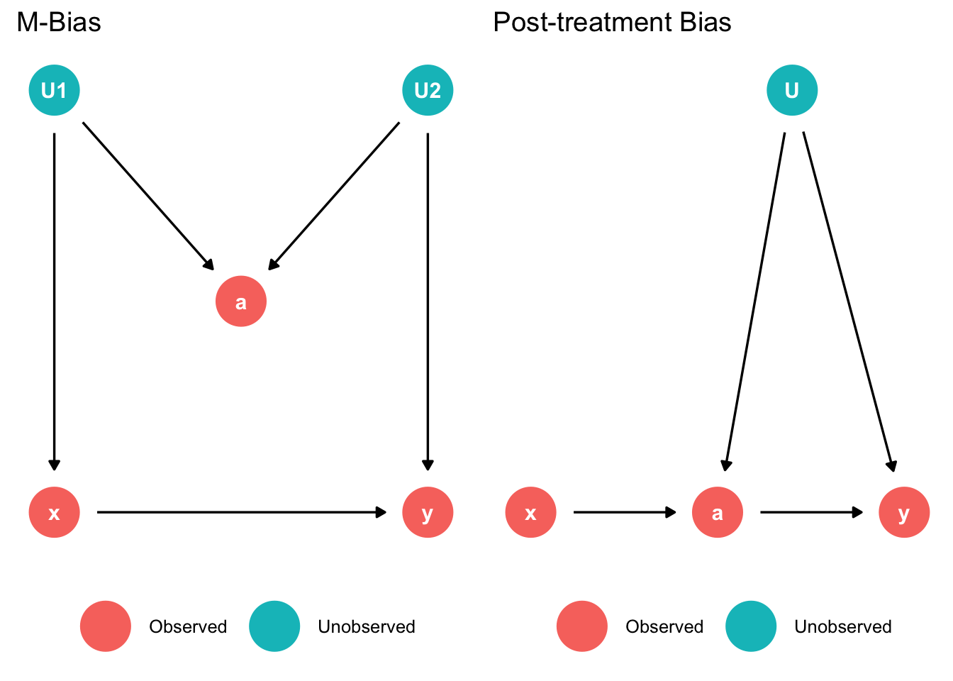
left: M-Bias
- Do not adjust for z since it would open the collider path
right: Post-treatment Bias
- Do not include post treatment variable “a” since it would open the confounder path (cannot control since u is unobserved)
Common bad controls
p1 <- dagify(y ~ x ,
       a ~ x + y,
      coords = list(x = c(x = 1, y = 2, a = 1.5, b = 1.5, U1 = 1, U2 = 2), y = c(x=1, y = 1,  a = 1.5, b = 0, U1 = 2, U2 = 2))
) %>%
  tidy_dagitty() %>%
  #mutate(fill = ifelse(name %in% c("U1", "U2"), "Unobserved", "Observed")) %>%
  ggplot(aes(x = x, y = y, xend = xend, yend = yend)) +
  geom_dag_point(size=12,
                 #aes(color = fill)
                 ) +
  geom_dag_edges(show.legend = FALSE)+
  geom_dag_text() +
  theme_dag() +
  theme(legend.title  = element_blank(),
        legend.position = "bottom") +
  labs(title = "Selection Bias")
p2 <-  dagify(y ~ x ,
       a ~ y,
      coords = list(x = c(x = 1, y = 2, a = 1.5, b = 1.5, U1 = 1, U2 = 2), y = c(x=1, y = 1,  a = 1.5, b = 0, U1 = 2, U2 = 2))
) %>%
  tidy_dagitty() %>%
  #mutate(fill = ifelse(name %in% c("U1", "U2"), "Unobserved", "Observed")) %>%
  ggplot(aes(x = x, y = y, xend = xend, yend = yend)) +
  geom_dag_point(size=12,
                 #aes(color = fill)
                 ) +
  geom_dag_edges(show.legend = FALSE)+
  geom_dag_text() +
  theme_dag() +
  theme(legend.title  = element_blank(),
        legend.position = "bottom") +
  labs(title = "Case-control Bias")
ggarrange(p1, p2)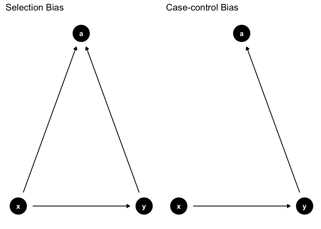
Intelligence, education, income
Case-control study: Observation ex-post. Ex.: Smoking \(\rightarrow\) lung cancer
Left: Selection Bias
- Do not include “a” since it would open the collider path
Right: Case-control Bias
- Do not include “a” since it is caused by y. Would bias effect of x on y.
Exercise
Prepare a short presentation of a (potential) DAG for your thesis
Moderation
- An effect of variable \(x\) on outcome \(y\) is moderated if it depends on another variable \(z\) in any way (strength, sign, …)
- In regression analysis we can test for moderation by including interactions (product of two variables) in the model
- E.g., the association of flipper length and body mass is moderated by the species
library(palmerpenguins)
library(ggstatsplot)
You can cite this package as:
Patil, I. (2021). Visualizations with statistical details: The 'ggstatsplot' approach.
Journal of Open Source Software, 6(61), 3167, doi:10.21105/joss.03167lm(body_mass_g ~ species:flipper_length_mm + species + flipper_length_mm, data = penguins) |>
broom::tidy() |>
gt::gt() |>
gt::tab_options(table.font.size = 35)| term | estimate | std.error | statistic | p.value |
|---|---|---|---|---|
| (Intercept) | -2535.836802 | 879.467667 | -2.8833770 | 0.004187922468810483 |
| speciesChinstrap | -501.358972 | 1523.459013 | -0.3290925 | 0.742290787208460534 |
| speciesGentoo | -4251.443811 | 1427.332228 | -2.9785944 | 0.003106357935232562 |
| flipper_length_mm | 32.831690 | 4.627184 | 7.0953936 | 0.000000000007691129 |
| speciesChinstrap:flipper_length_mm | 1.741704 | 7.855734 | 0.2217112 | 0.824673398945700575 |
| speciesGentoo:flipper_length_mm | 21.790812 | 6.941167 | 3.1393586 | 0.001843295165362903 |

